Carnegie Mellon · Advanced Interaction Design
CVS Store Map & Trip Planner
Designing an accessible in-store wayfinding experience for CVS’s most loyal customers, while still growing in-store spend.
- Interaction Design
- Accessibility
- Mobile
- Kiosk
- AI-assisted
Overview
CVS wanted shoppers to spend more in store. Its most loyal shoppers were the least happy.
The brief asked for new digital features that would increase in-store spending and dwell time, and help CVS be seen as a retail store, not just a place to pick up prescriptions.
When I dug into the survey data, a different problem stood out. Customers aged 50+ drive most of CVS’s sales, yet they gave most of the lowest satisfaction scores. I reframed the project around them: make the in-store trip easier for seniors first, then find moments to promote deals that fit what they’re already buying.
The problem
Figures from the course’s CVS dataset and survey.
Reframing the brief
The stakeholder’s brief explicitly ruled out a store map. A past aisle locator had been sunset because it undercut staff selling, even though it lifted sales 2.1% and earned the highest satisfaction score of any initiative.
If I had followed the brief as written, I would have redesigned the existing time-limited ExtraBucks offers. But older customers told us countdowns made them anxious. I chose to bring back wayfinding instead, and to make the business case for it:
- Seniors need it. One 65+ customer wrote that the aisle finder read out loud with their screen reader, and it was the first time they found what they needed without asking anyone.
- Competitors already have it. Target and Walmart both offer interactive store maps.
- A shorter trip can still be a bigger basket. Promotions tied to a shopper’s history and current list are more likely to convert than generic deals. Usability testing backed this up.
The solution
Plan a trip, follow the route, find the item
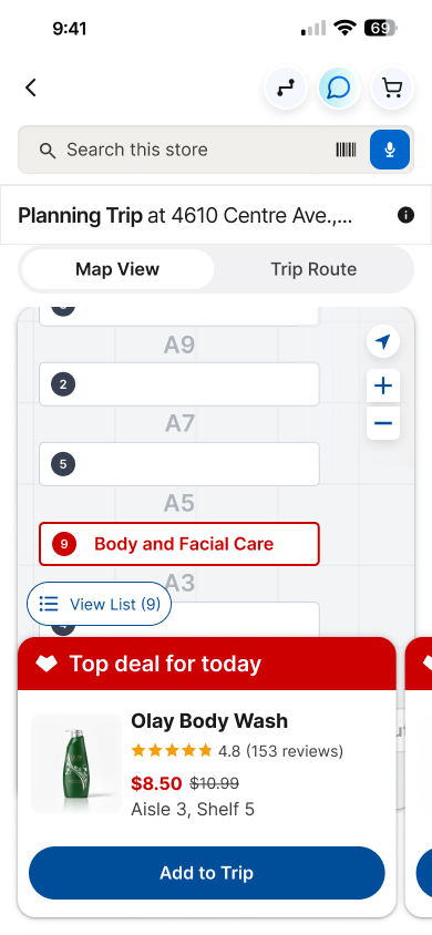
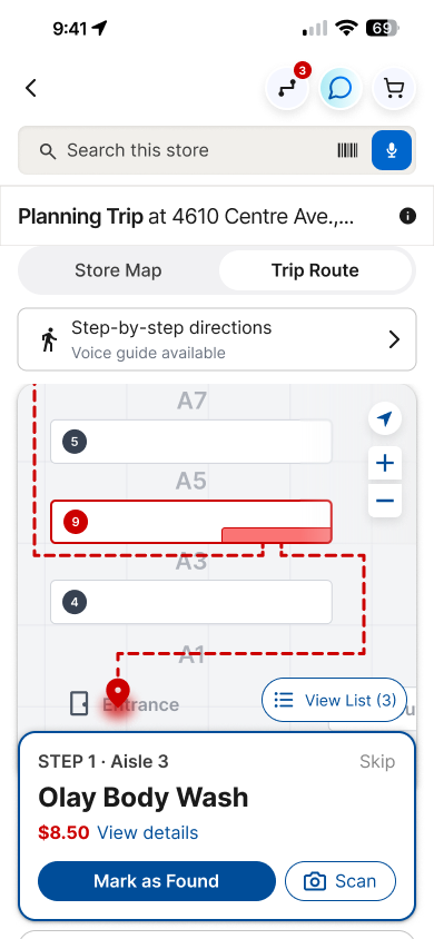
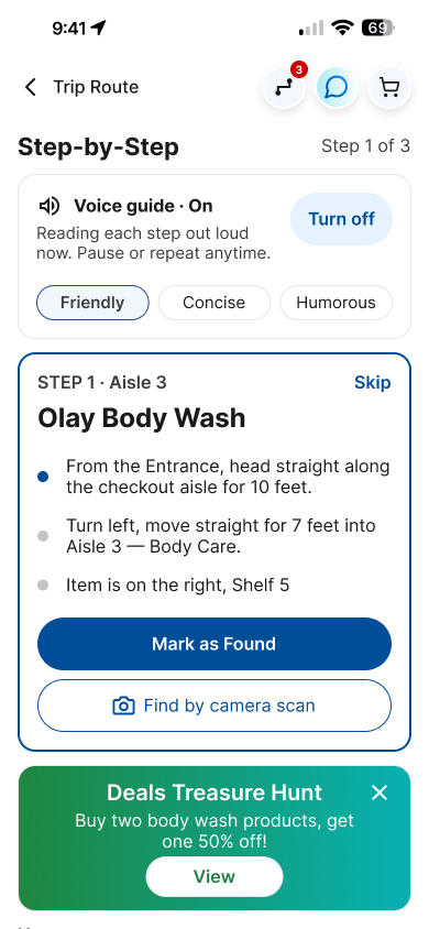
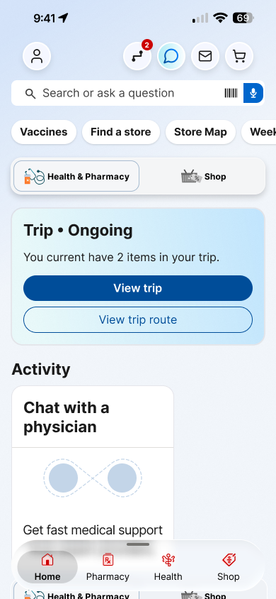
Shoppers build a trip from Home, Shop, or a product page. The store map shows where everything is and the best deals by aisle. The trip route walks them from the entrance to each item, with a step-by-step text guide for anyone who prefers reading, or can’t see the map.
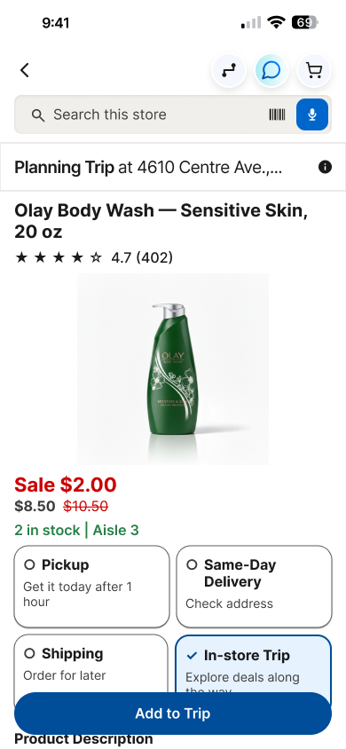
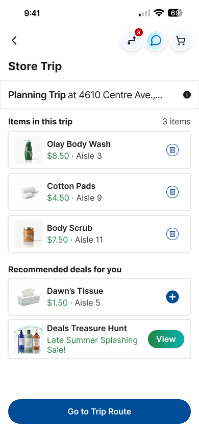
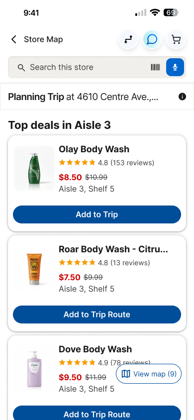
Equal experience: Step-by-Step
The map is one way in. The list is another, not a fallback.
I wanted people with low vision, and people who simply prefer directions in words, to get the same trip. I watched videos of blind users navigating apps with screen readers, then worked through usability questions (like whether screen readers can reach visually hidden text) before designing.
- Written walking directions stay on screen. Hiding them for screen readers only would leave out low-vision seniors who don’t use VoiceOver.
- Voice guide is optional and off by default. Tone options (Friendly, Concise, Humorous) only appear once it’s on, to cut clutter.
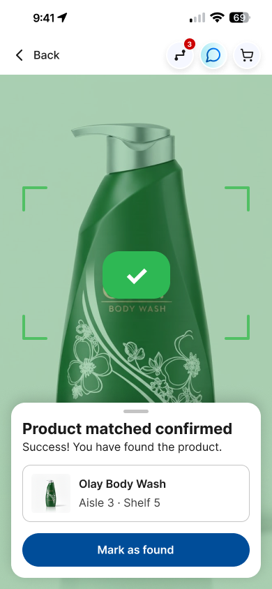
- “Mark as Found” is a button, not a swipe. A swipe-only action conflicts with screen-reader gestures and fails WCAG 2.5.1.
- Find by camera scan. At the shelf, shoppers can scan an item. A sound and vibration confirm it’s the right one.
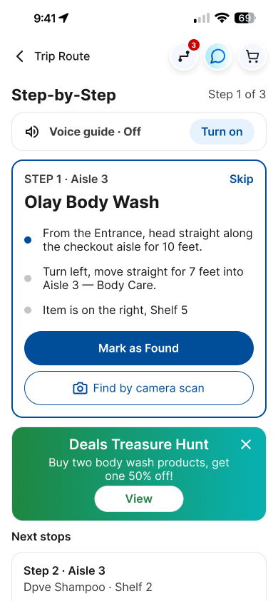
Accessibility details
- Bigger header buttons. The live app’s cart and AI buttons are 30px with 20px icons. They pass WCAG AA (24px), but I enlarged them to 40px to move toward AAA’s 44px for people with tremors or limited dexterity.
- Body text 16px or larger, high-contrast text and controls, and full-word labels instead of icon-only buttons.
- Nothing is color- or icon-only. Every map badge has a matching full-word list.
- Aisle numbers mark the walkway, not the shelf. From store visits and photos, I noticed CVS aisle numbers label the path between shelves, so the map does too.
Engaging younger shoppers: Deals Treasure Hunt
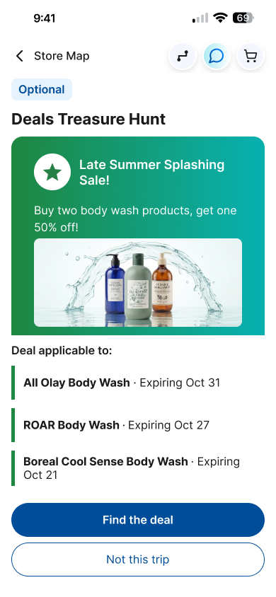
Younger customers loved flash deals and in-store coupons in past CVS initiatives. The Deals Treasure Hunt is an optional, skippable mission layered on top of a normal trip. It adds a deal stop to the route, and completion is confirmed by the shopper, not inferred from location tracking.
Signature microinteraction
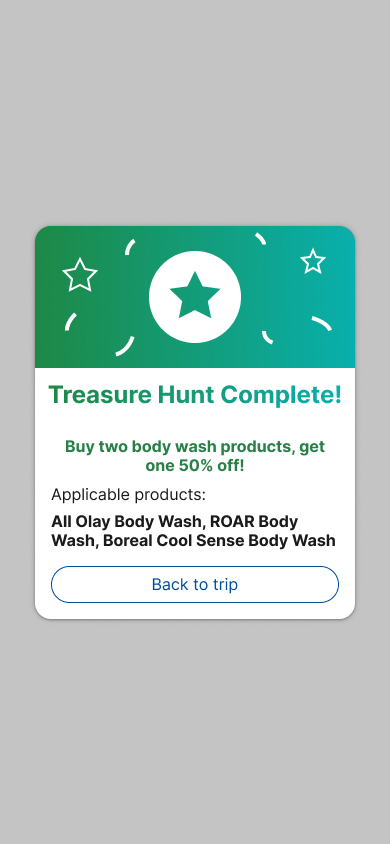
When a shopper taps Mark as Found on the last deal, a “Treasure Hunt Complete!” popup appears. Its header animates with pulsing stars and confetti, looping until the popup is closed, and the phone vibrates three times. The popup is fully readable by screen readers and closes with one clear button. Positive feedback like this is what brings people back to the feature, and back to the store.
I also designed two smaller blinking-light cues: a pulsing location pin when Location Services are on, and a blue light on the current step in the step-by-step guide that advances as the shopper walks.
Iterating from usability testing
Users struggled with the bottom sheet
Think-aloud sessions showed people didn’t know what the bottom sheet was for. There was too much information and too many actions competing on screen.
I looked back at the live CVS app and found the Store Locator already shows results as cards in a swipeable carousel. I rebuilt the aisle deals in that pattern, lifted the dock off the screen edge as a card, and removed the “Open full map” and Sales/Products filters, which earlier revisions had made unnecessary.
Edge cases
- Location Services off. An iOS-style alert explains why location helps and lets people turn it on, or continue without it.
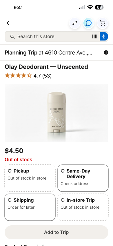
- Sold out. The product page shows the item is unavailable, and Add to Trip is disabled.
Second screen: in-store kiosk
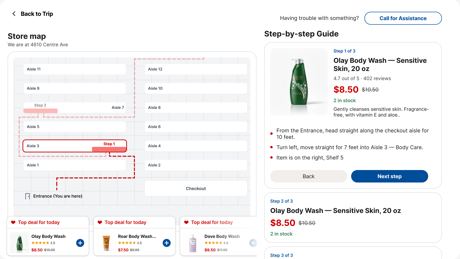
A 21.5-inch touchscreen kiosk at the entrance (and ideally a few more in store) gives everyone a bigger map. A split screen shows the trip route on one side and the step-by-step guide on the other, with a Call for Assistance button. I left voice off the kiosk on purpose: other shoppers shouldn’t overhear someone’s shopping list.
Designing with AI
I used Cursor AI to assist in parts of the design process: generating early rough wireframes and drafting a starting component library from screenshots of the live CVS app. I then corrected and refined those components by hand to match the real app. The final screens were designed and polished by me.
Reflection
- Reframing the brief was the project. Going to a CVS store with a senior persona surfaced details I never would have found in the requirements.
- Data keeps you honest, but it shouldn’t steer every turn. It told me my problem was real. Re-designing at every new data point would have stalled progress.
- With more time, I’d explore more ideas early (the Treasure Hunt came right before testing), add a font-size control and language selector, and test with more seniors beyond my own relatives. As someone who uses the CVS app at a larger font size myself, that scaler is the feature I most wish I’d had time to build.