Hemlane
Accounting – Bank Sync
Re-designing the experience for users to import transactions, synchronize accounts, and other quality-of-life features to make accounting easier.
- UX Design
- UI Design
- Mobile Web
- Finances
- Dashboard
- B2B
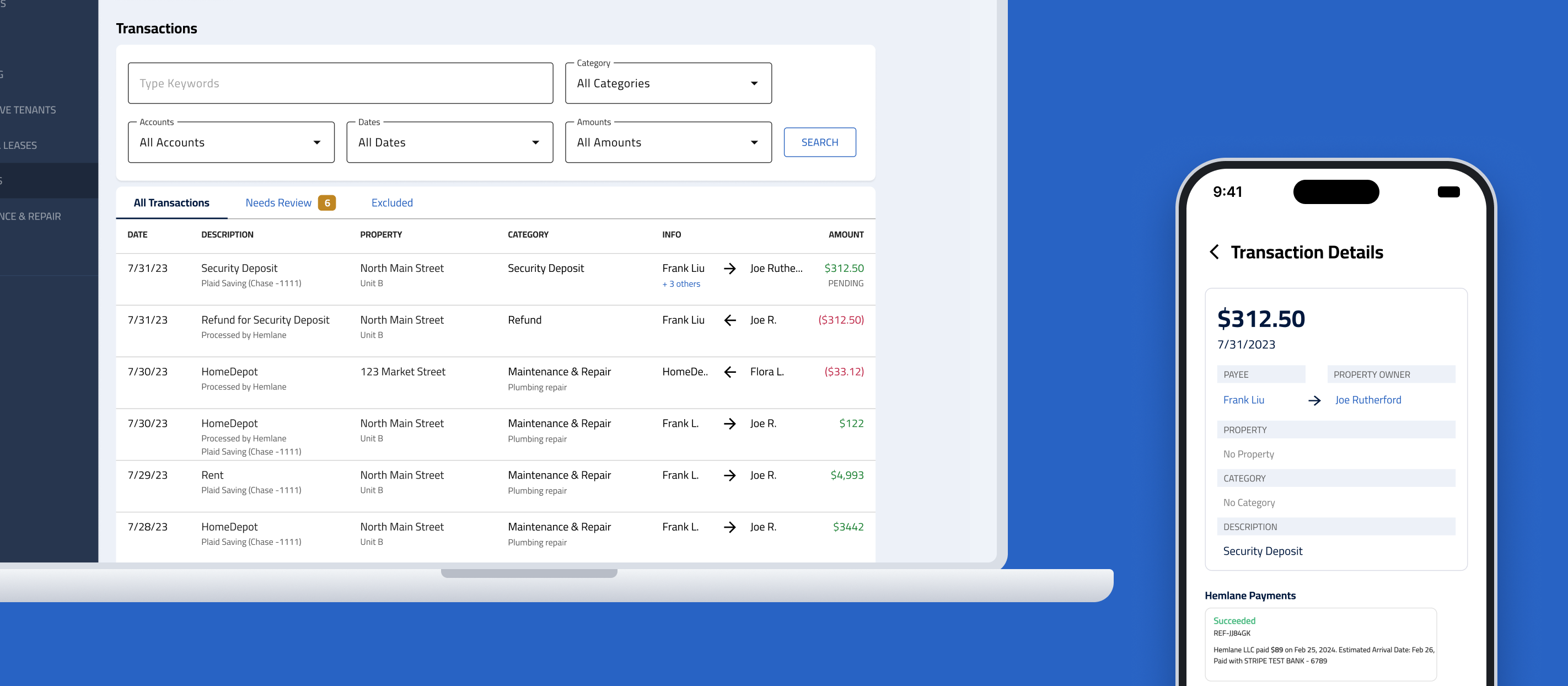
Impact
Reducing feature churn on Hemlane’s accounting features and improving customer satisfaction
Hemlane users had expressed negative sentiments about the state of financial bookkeeping features through product reviews and exit surveys. My work aimed to remedy these customer pain points and provided new accounting capabilities for users who utilize Hemlane to help manage finances, accounting, and other bookkeeping processes for property owners.
Hemlane is a SaaS property management startup that strives to enhance its product and develop new helpful features for users to manage their properties and rentals. In early 2024, the product team decided to redesign the accounting product and implement a new bank transactions import feature to improve the user experience in the financial tab.
I took charge as the lead UX designer for the Bank Sync feature, the last part of the whole accounting redesign. Through research and collaboration with developers, I gained valuable insights and overcame challenges, ultimately designing a product that made an impact on the business and received a positive reception.
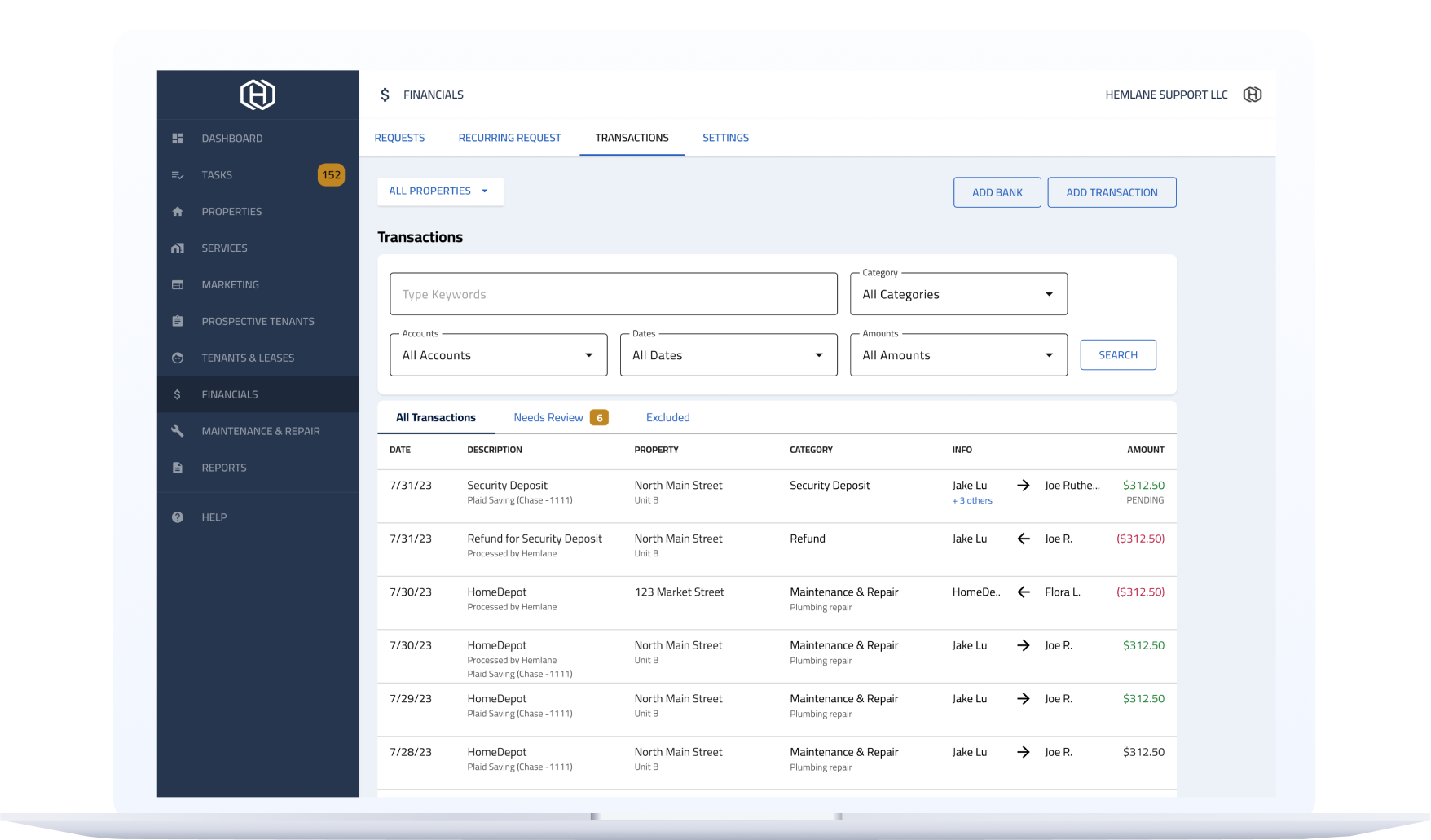
Background
Hemlane makes tasks easier for property owners, property managers, and tenants. Key functionality on the platform includes:
- Rent collection — collect or pay rent on the Hemlane platform
- Financial transaction tracking — record and track transactions for your property
- Repair coordination — a 24/7 coordination service for repair work orders
Context
Customers were leaving because accounting was manual and time-consuming
Without bank transaction sync, financial accounting was manual and slow, especially for users with more than one property. Customers often resorted to adding transaction data by hand, or used another bookkeeping product to finish accounting for their properties. Several decided to leave Hemlane for our competitors.
“We have outgrown Hemlane. The accounting and maintenance services are not sufficient for our operations.”
— Owner of 13 properties
“The accounting body of Hemlane is not suitable for the amount of doors for my portfolio… [The] product just doesn’t fit my needs anymore.”
— Owner of 9 property units
The goal
Design a Bank Sync feature that imports transaction data from the bank, and build the tools to modify that data as needed
- Transaction management and recording tools can speed up the accounting process for property owners and managers.
- Implement new features to edit, exclude (hide from view), connect, and split transactions for bookkeeping.
Research
I gathered industry best practices through competitor research and spotted weaknesses in Hemlane’s UI through a product audit.
Product audit
- Conflicting indications of which direction money is flowing between two accounts created mental blocks for users and slowed them down.
- Some UI elements appeared outdated, as they had not been updated for 3 years.
Competitor analysis
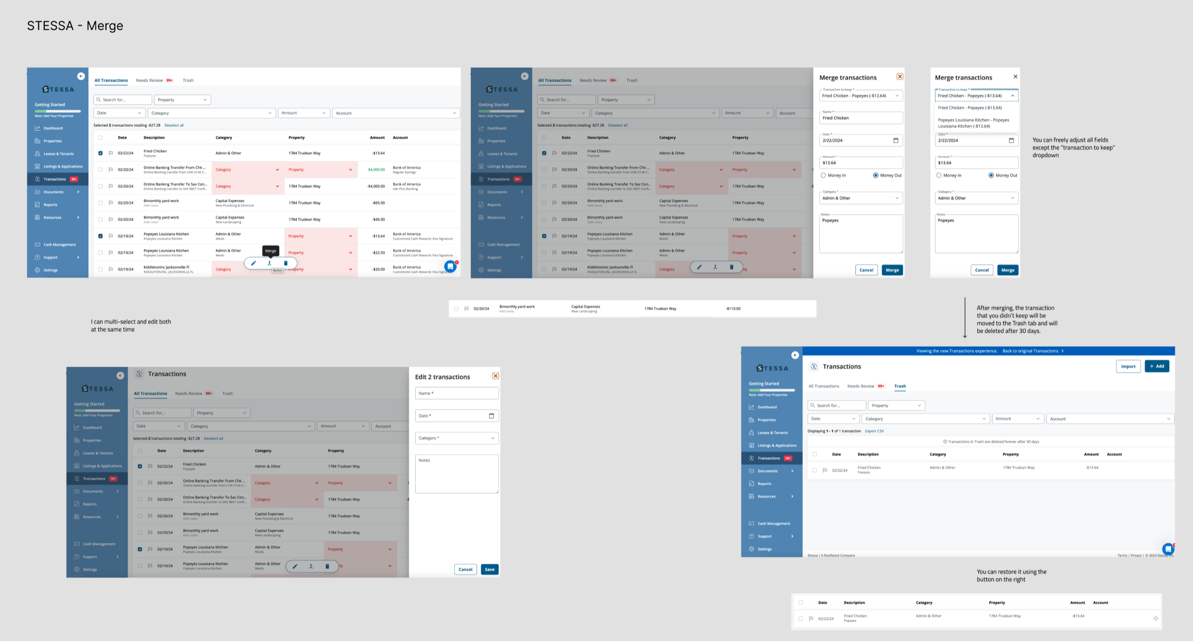
I studied Buildium and DoorLoop (property management software) and Stessa (accounting software for landlords). Patterns we adopted:
- A split-transaction tool
- A merge tool for duplicated imported transactions
- A simplified financial dashboard with fewer categories, to present data more clearly and let users act fast
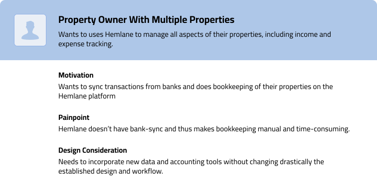
User persona & user flow
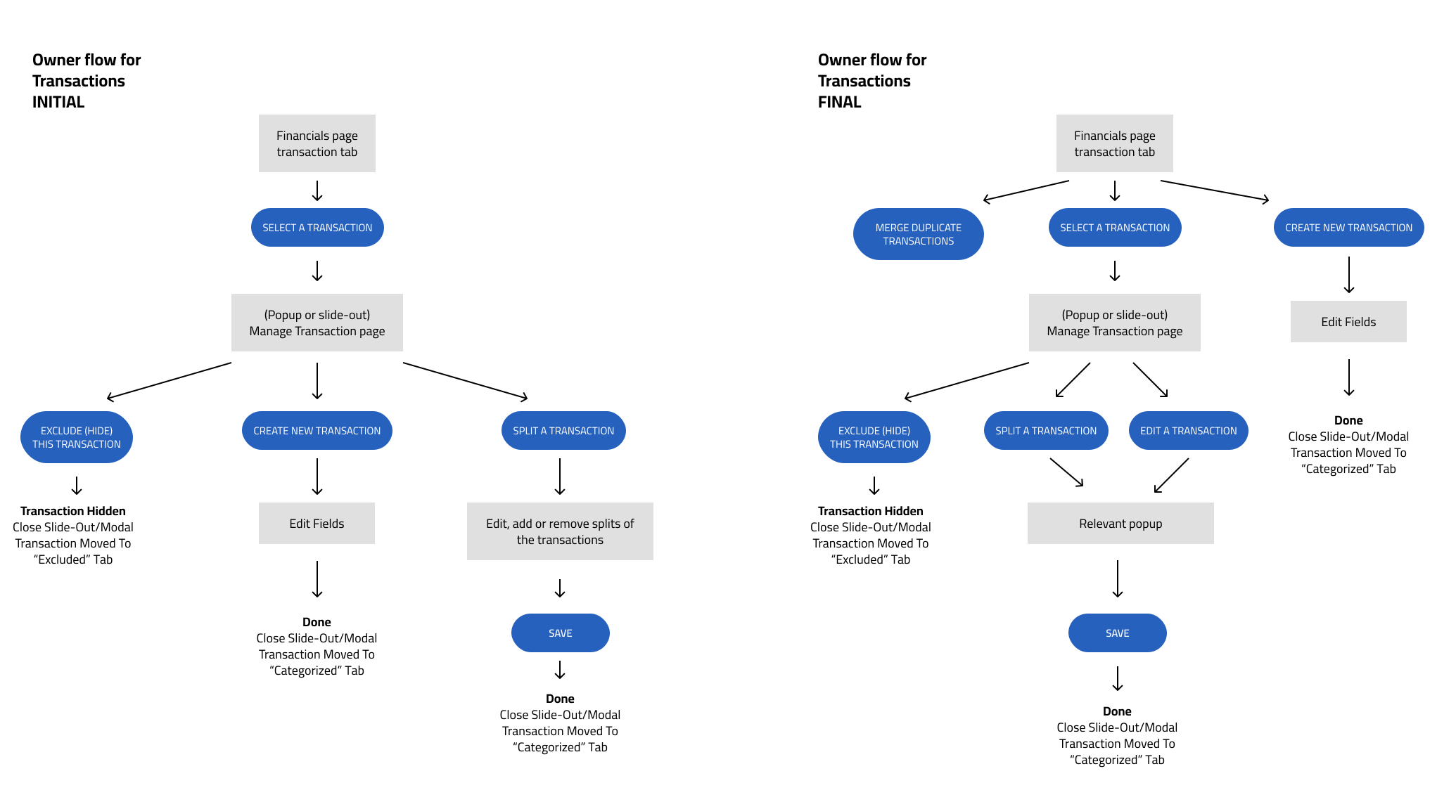
Our core user is a property owner with more than one property. I created a user flow to clarify the different actions related to bank sync, transaction editing, and transaction merging.
Design highlight 1
Clarifying money-flow direction in the transaction popup
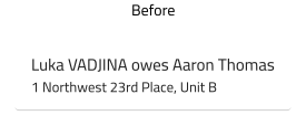
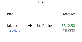
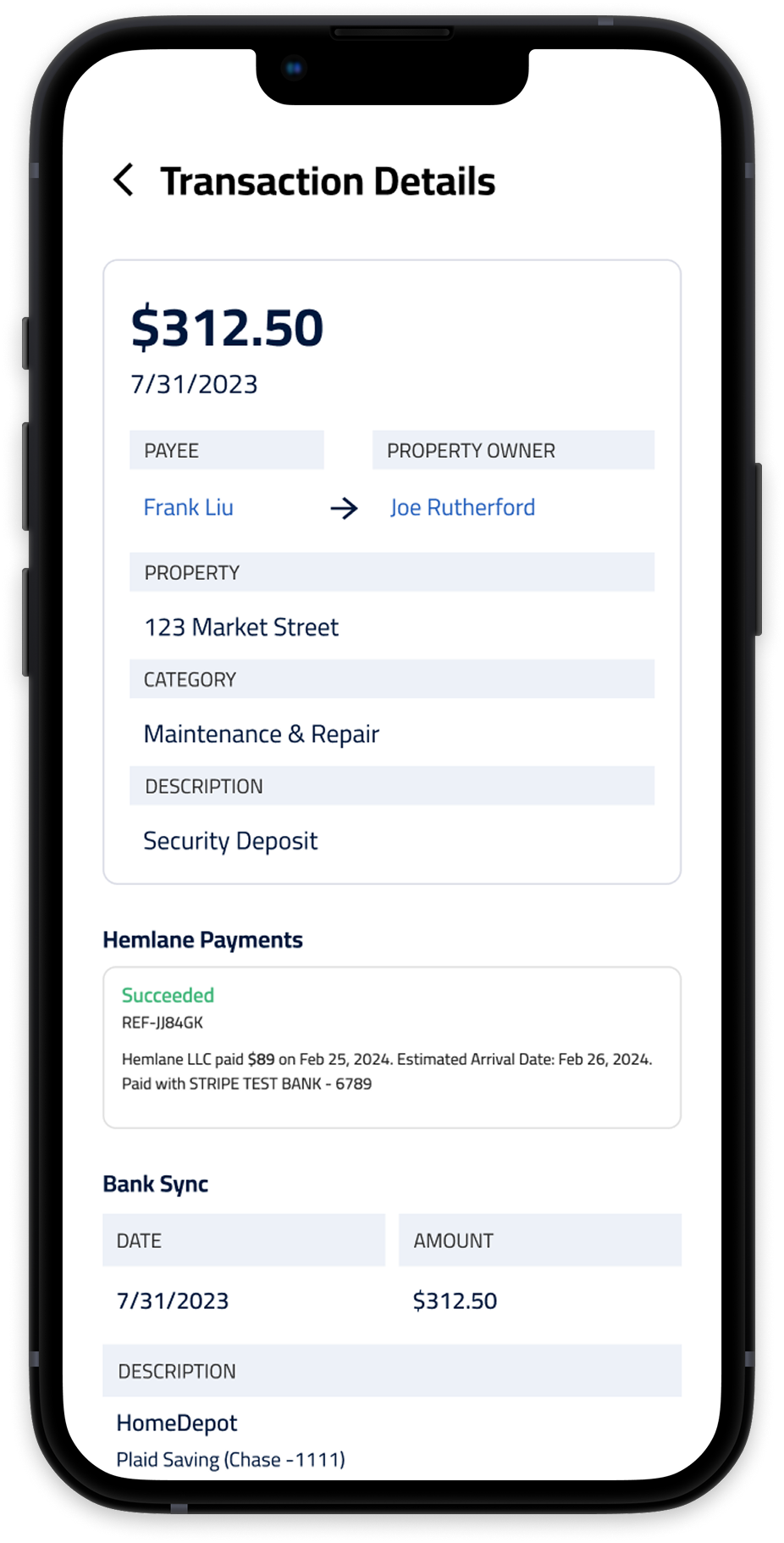
Problem — lack of clarity. Product owners had identified that users struggled to understand who was paying whom in the interface. The old design showed no direction of money flow and relied only on verbiage, which was hard to understand at first glance and cost users time.
Solution
- An arrow represents payment flow on the dashboard
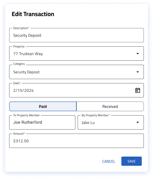
- On smaller UI, the arrow is removed and By/From labels are added to the modal
- Jargon is replaced with natural language
Outcome
- Improved clarity — users find the interface easier to understand
- Improved ease of use — users perform tasks faster
Design highlight 2
Letting users view transaction details, and split or exclude transactions when needed
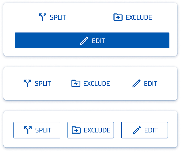
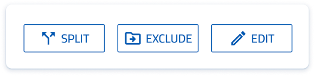
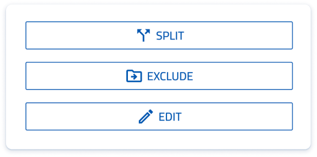
Problem — limited spacing. As we added more tooling to the bank sync feature, it became difficult to present all of the CTAs in the mobile responsive web interface.
Process. I tested several layouts for the call-to-action buttons while designing the modal screens.
Solution
- Stack the buttons
- Outline the buttons
- Use an outline border instead of a colored background

Outcome
- If you prioritize nothing, you prioritize everything — keeping all of the CTAs the same size and style
- Improved efficiency — users can reach a higher degree of financial accuracy in reporting
- Less visual friction — less clutter and noise while completing tasks
Design
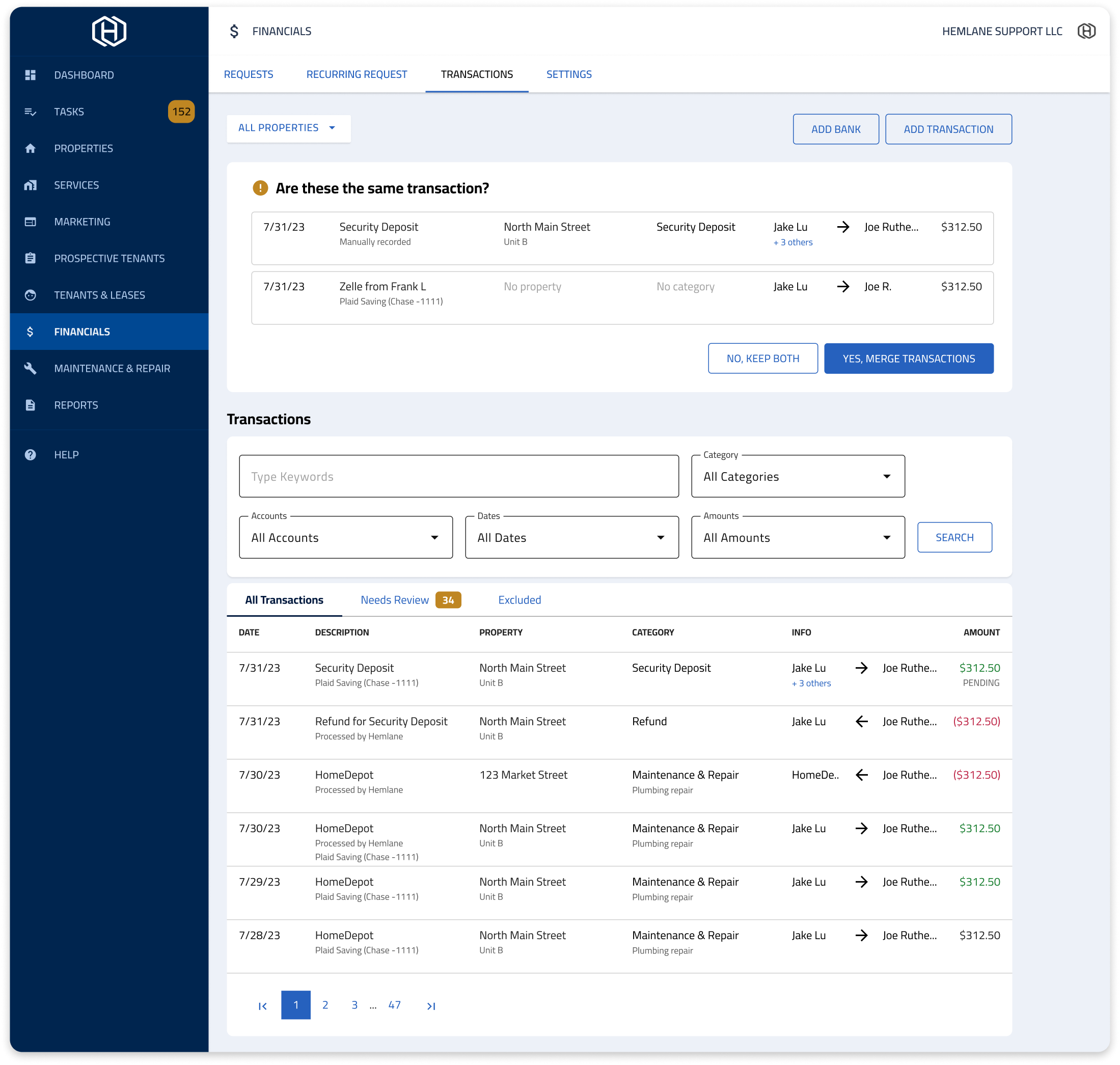
Prototype
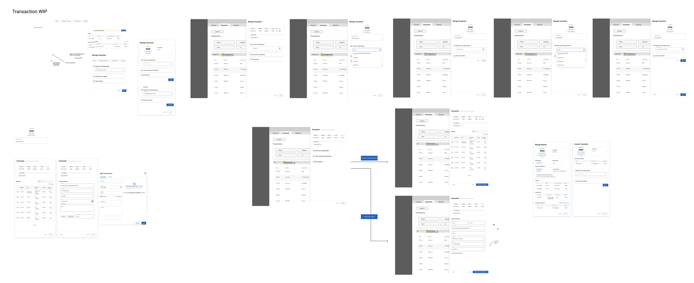
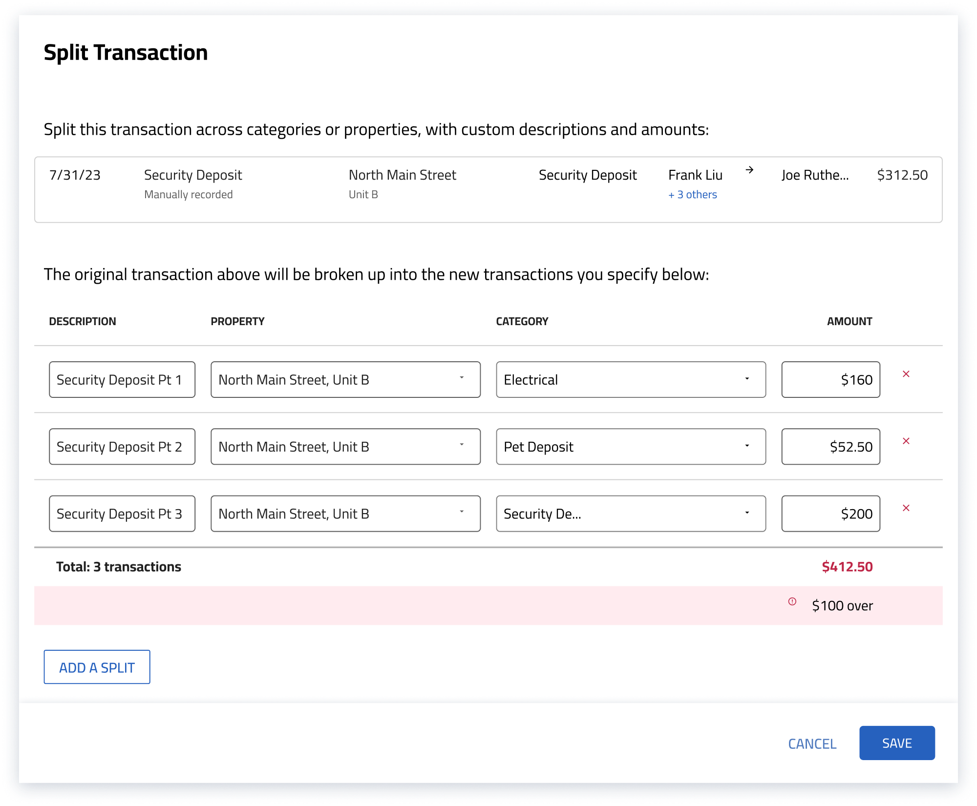
Focused on detailed interactions
- Add new transaction — the CTA is positioned at the top
- Edit transaction — clearer wording throughout
- Split transaction — users can now split one transaction into multiple equal or non-equal smaller transactions
Post-launch
Customer reviews highlighted how imported transaction data streamlined bookkeeping. The feature launched around the April tax-filing deadline and was quickly adopted for users’ accounting needs.
“I’m thrilled about the new connect to bank feature…”
— Emily, property owner in California
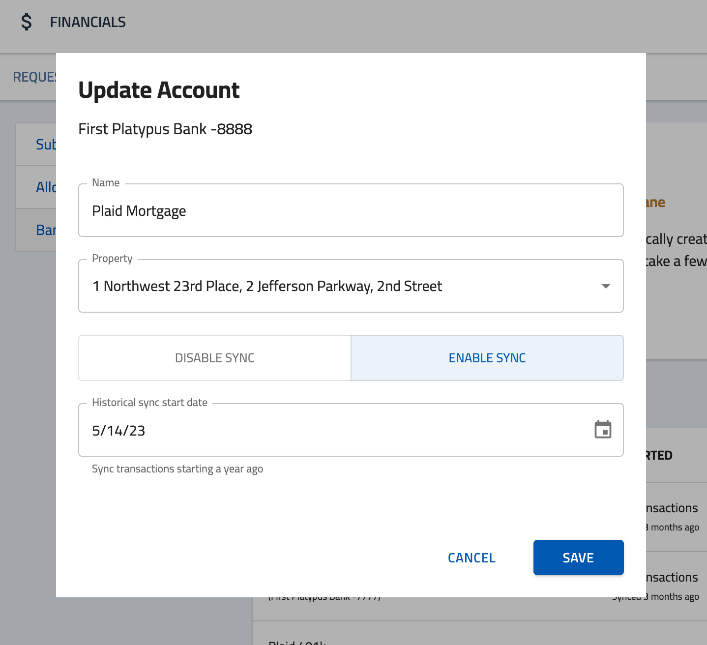
Iteration. After launch, several users asked for a date range for data syncing, so we added one.
Takeaways
- Good communication keeps the product moving on time. Close cross-functional communication kept the project progressing smoothly.
- Spot pain points through many kinds of customer feedback — online reviews, exit surveys, and in-product surveys.