Hemlane
Services Tab & Repair Coordination
Feedback revealed that many users were unaware of Hemlane’s essential services. My role was to showcase and promote our features within a single, easily accessible tab.
- Product Design
- UI Design
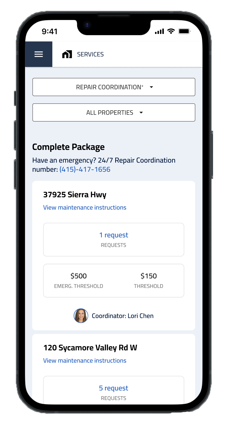
- Responsive Web
- B2B
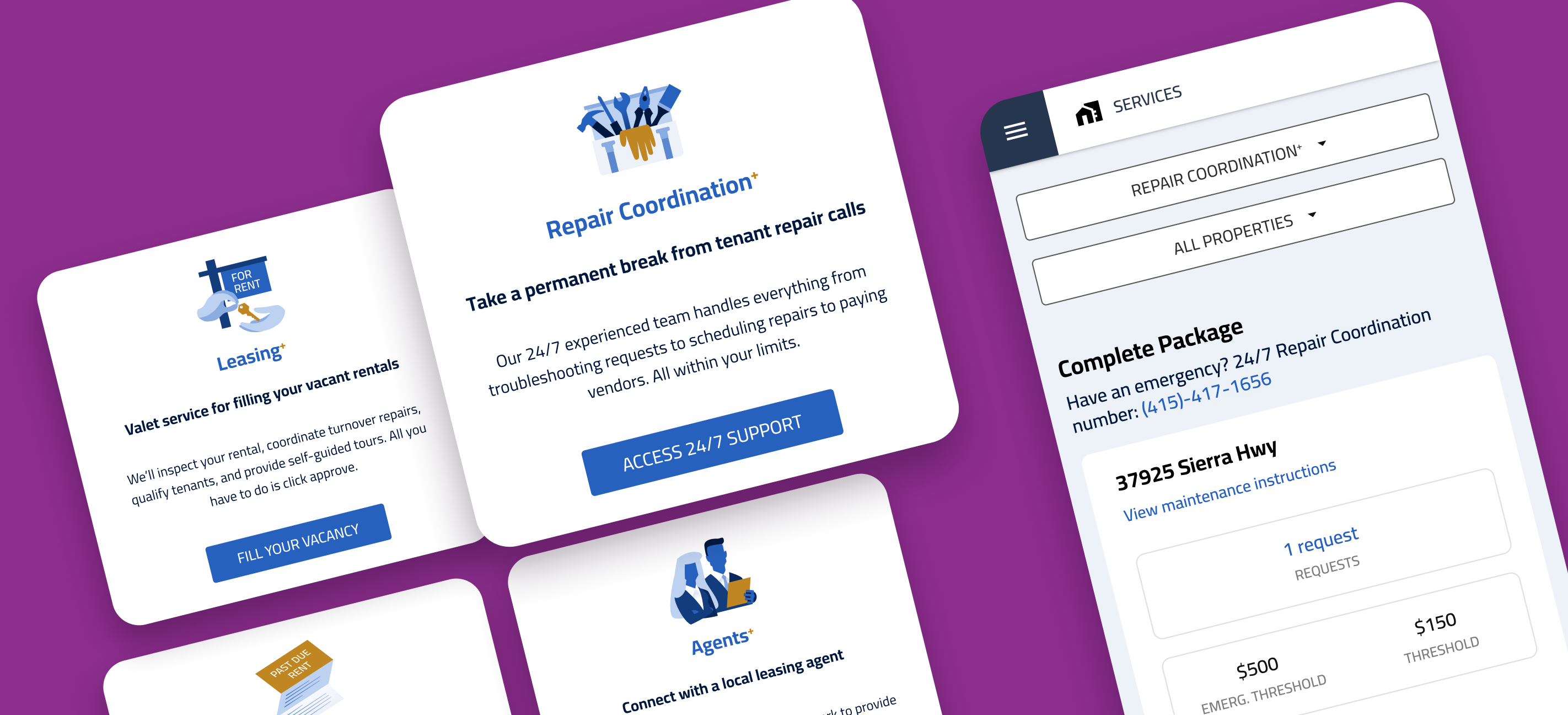
Many users didn’t know Hemlane offered essential services, such as our comprehensive leasing options with five mix-and-match services. In this case study, I focus on the Services tab and the Repair Coordination+ detail page.
Impact
The product saw 2X weekly package upgrades in the first week of launch. The Services tab also became the home for future features: within 6 months we added one new feature (which I also designed), and it slotted into the tab quickly.
Design process
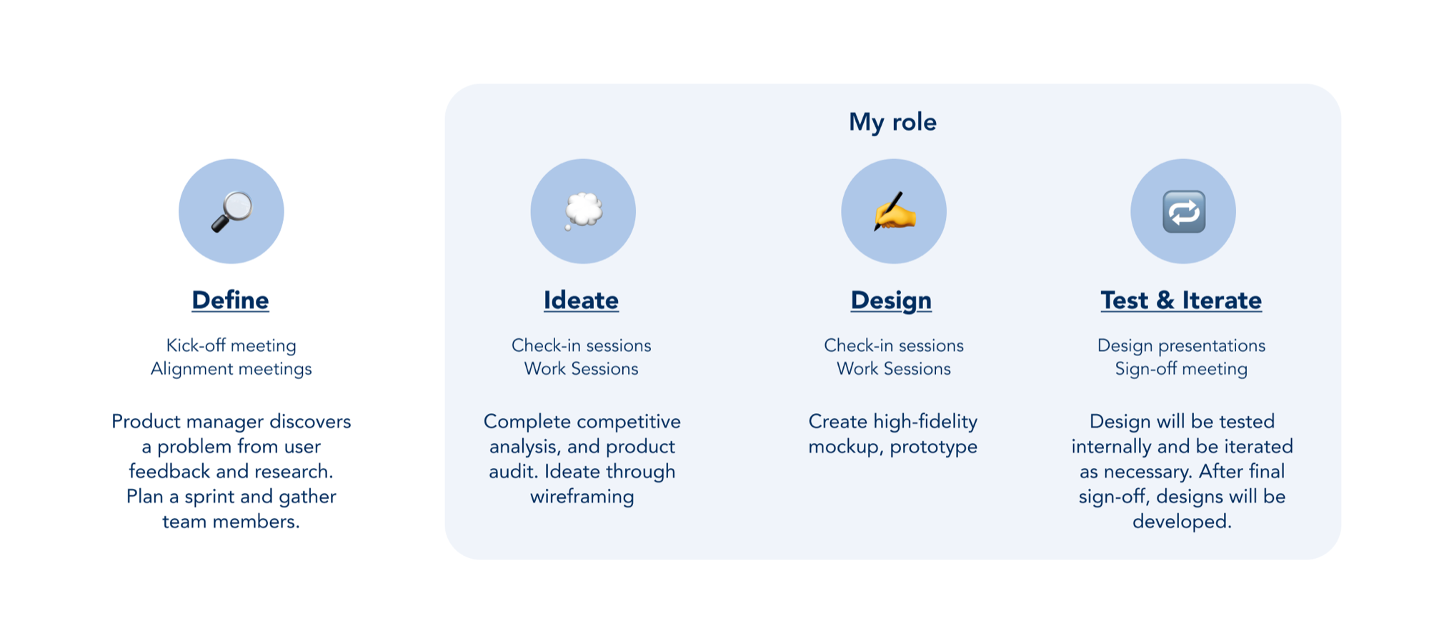
As a fast-paced, compact startup, Hemlane moves quickly in product design and development. We worked in an Agile environment that encouraged collaboration and quick iterations. Problems were typically defined up front by the PM or stakeholders.
Background
Users were churning for products we already had but were hard to find
In Q3 2023, the product team identified a significant issue: customers were churning to competitors because they were unaware of our existing features. The solution was a Services tab that displays and promotes product features.
The goals
- Create a new tab to display all offered services and promote the ones a user hasn’t subscribed to
- Design individual service pages that show summarized data and link to the right places for goal-specific actions
What I did
- Designed the all-new Services tab to feature Hemlane’s services
- Collaborated with cross-functional teams to learn about specific services like Eviction Guard and Repair Coordination
- Designed each service’s feature page, including services that had no detail page at the time
Research
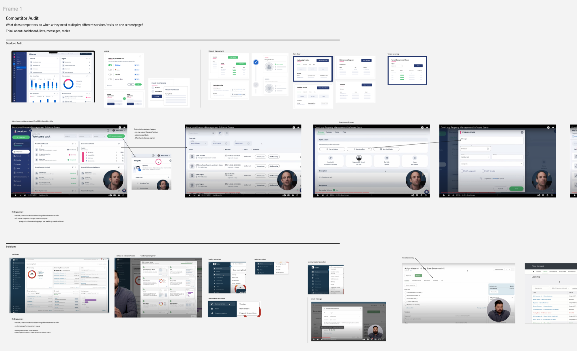
I conducted a UX audit, analyzed competitors, and gathered existing best practices.
Hurdles
Overview vs. details
Stakeholders disagreed on whether the tab should be a hub of links or hold details and CTAs. We agreed the Services tab would focus on showing and promoting features.
Keeping consistency
Four features were available at the time, and there was no design library. I designed the four features one at a time, using the existing in-app styles.
Design: Services tab
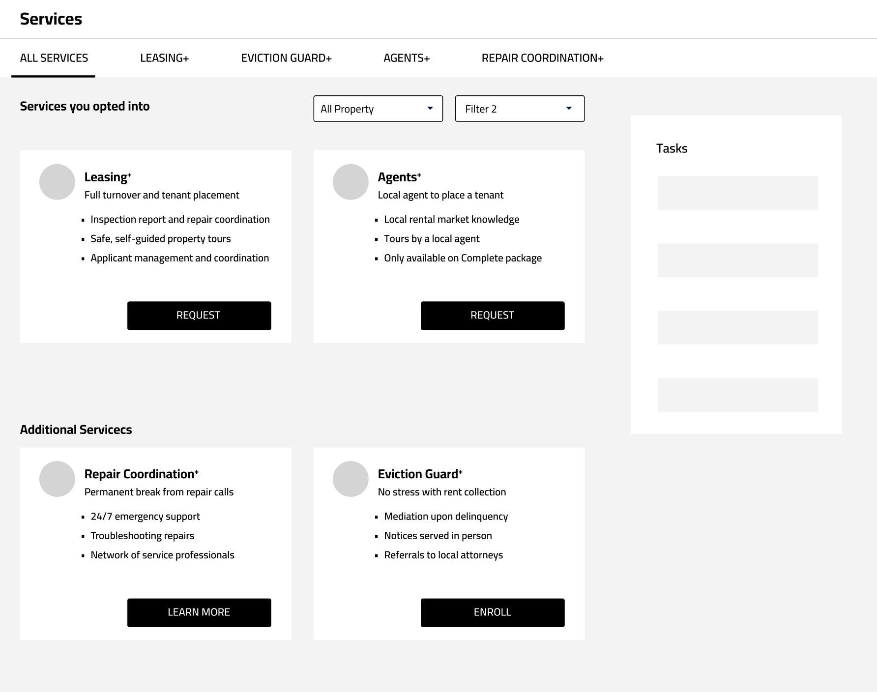
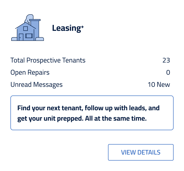
Round 1 · Getting started
The first cards were too text-heavy; the copy came straight from the project manager.
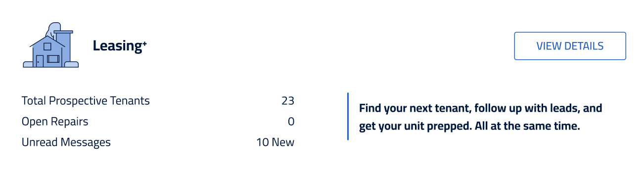
Round 2 · Horizontal cards
We tried a horizontal card style, but it wasn’t suitable for the Services tab.
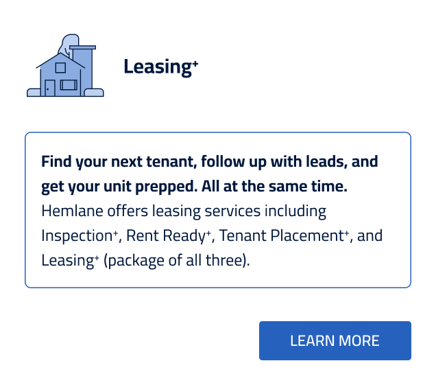
Round 3 · Simplifying
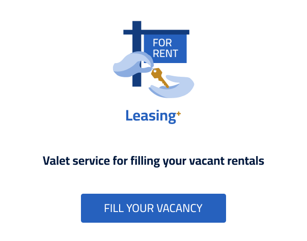
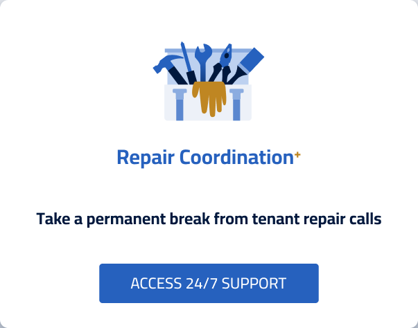
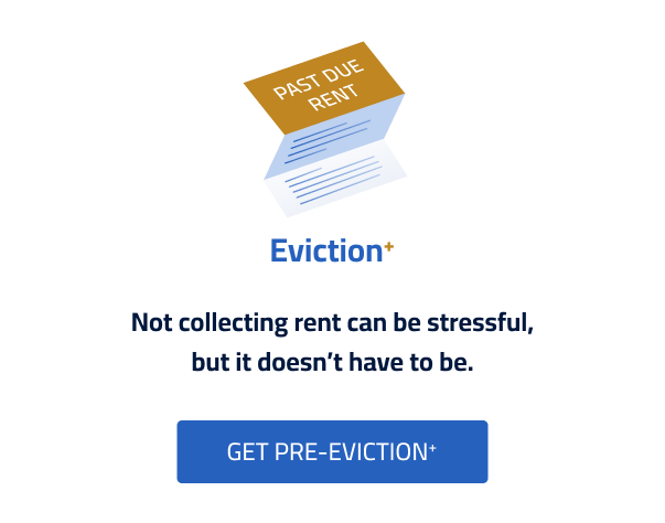
Vertical cards showing the product description only, with the focus on CTA language.
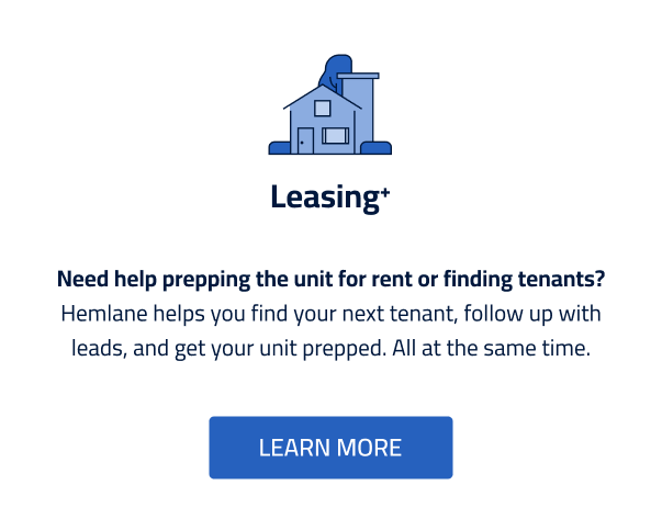
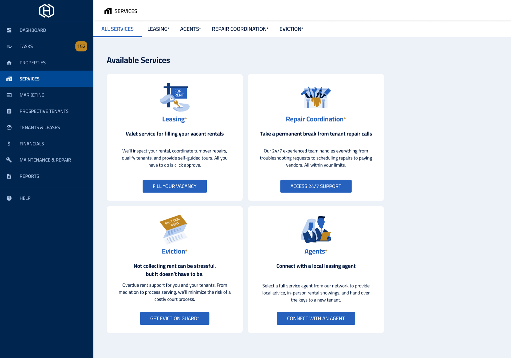
Final
Graphics in the primary brand colors, and a unique CTA for each product.
Design: Repair Coordination+ page
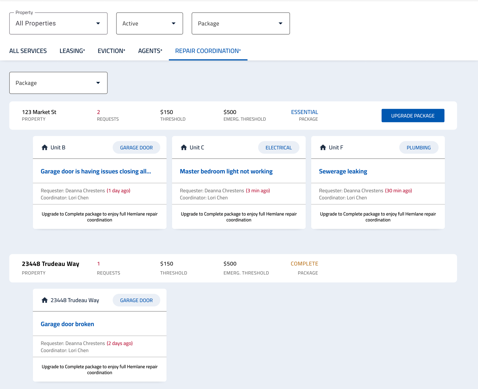
First mockup
Each property listed its open work orders as individual cards.
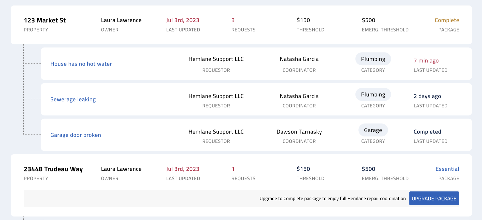
Round 1 · Reorganization
Removed the work-order cards, moved to a horizontal style, and added “Last Updated” info.
Round 2 · Simplification
Only 4 fields on each property card, plus a space for a CTA or notice.
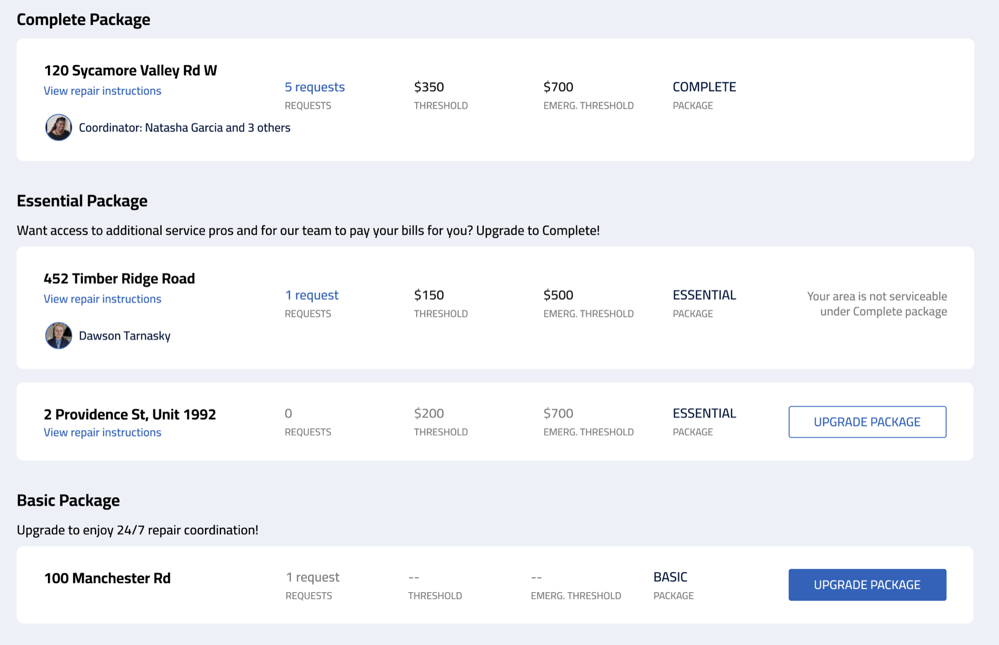
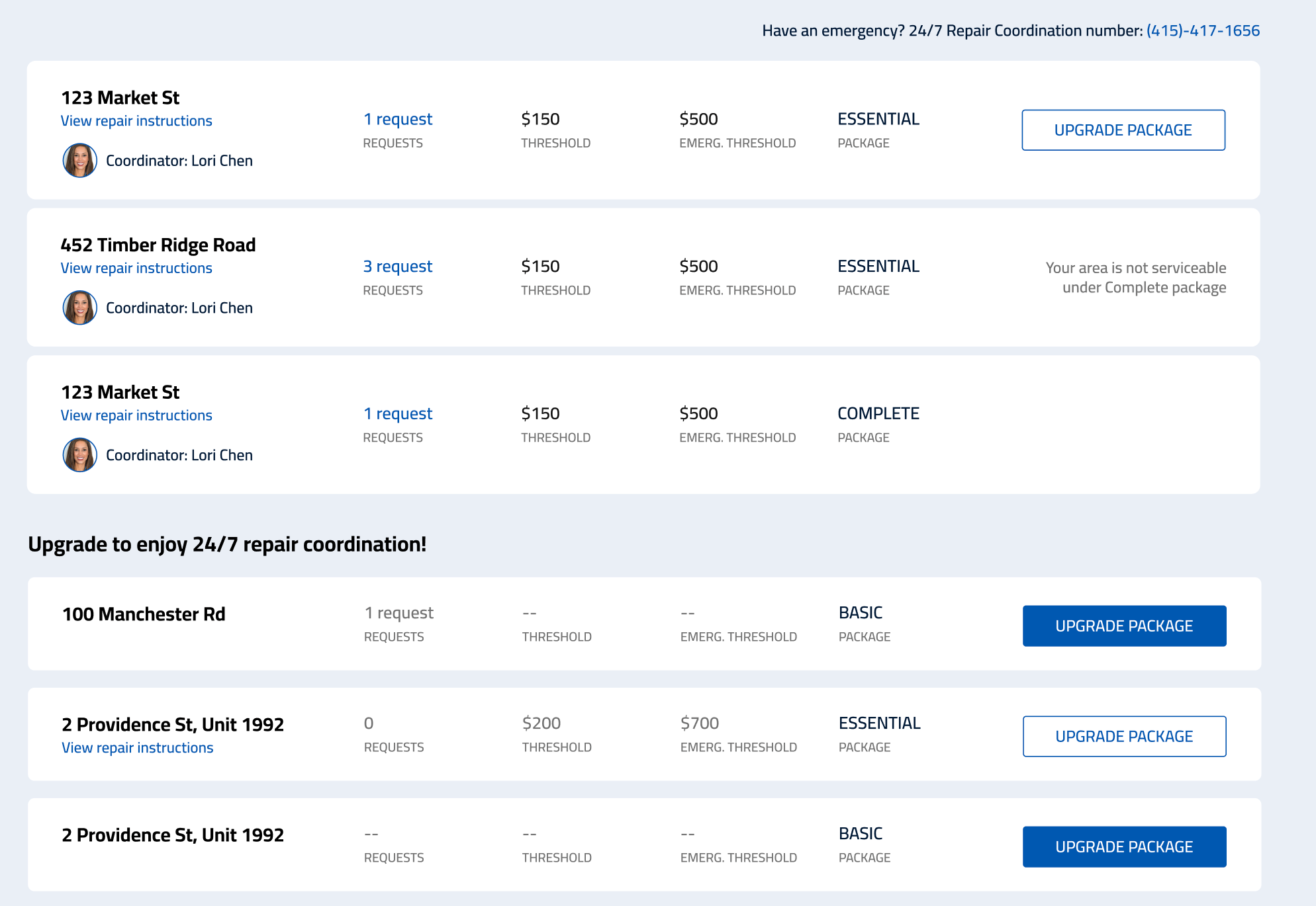
Round 3 · Categorization
Properties grouped by package type, with promotional copy for each category.
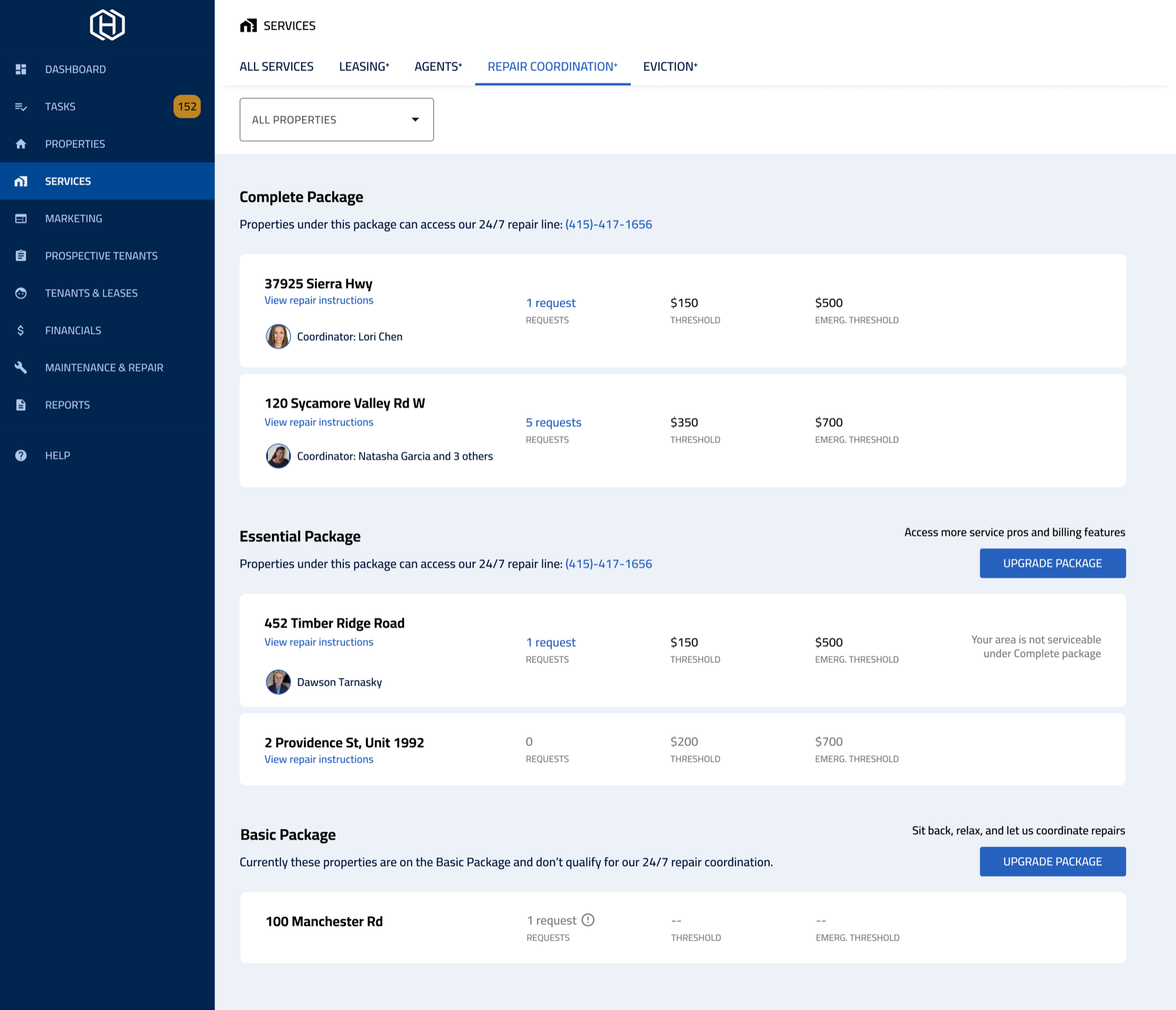
Final
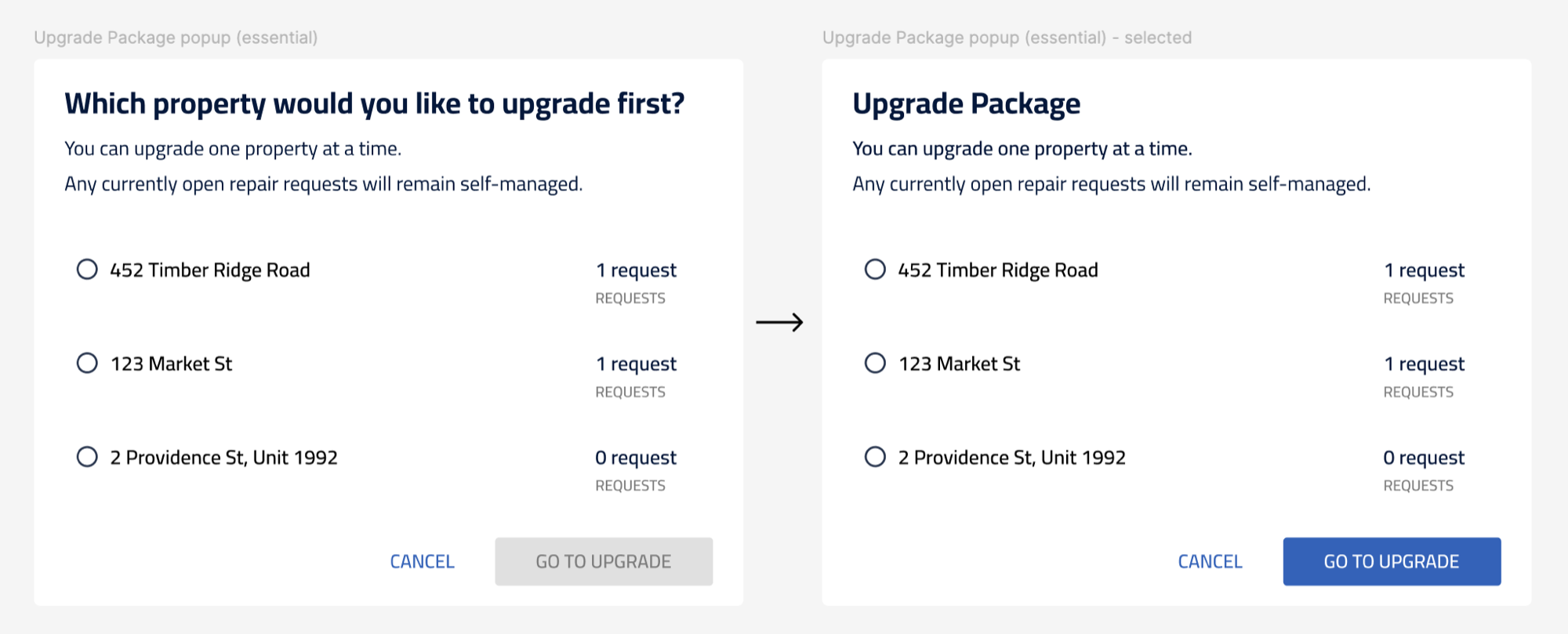
CTAs moved out of the cards into one general CTA that opens an upgrade modal. Instead of 10 individual CTAs, users see at most 2 on the page.
Prototype
Connecting the actions
I built the Services prototype last, since the other feature pages had to exist first to connect the upgrade flows.
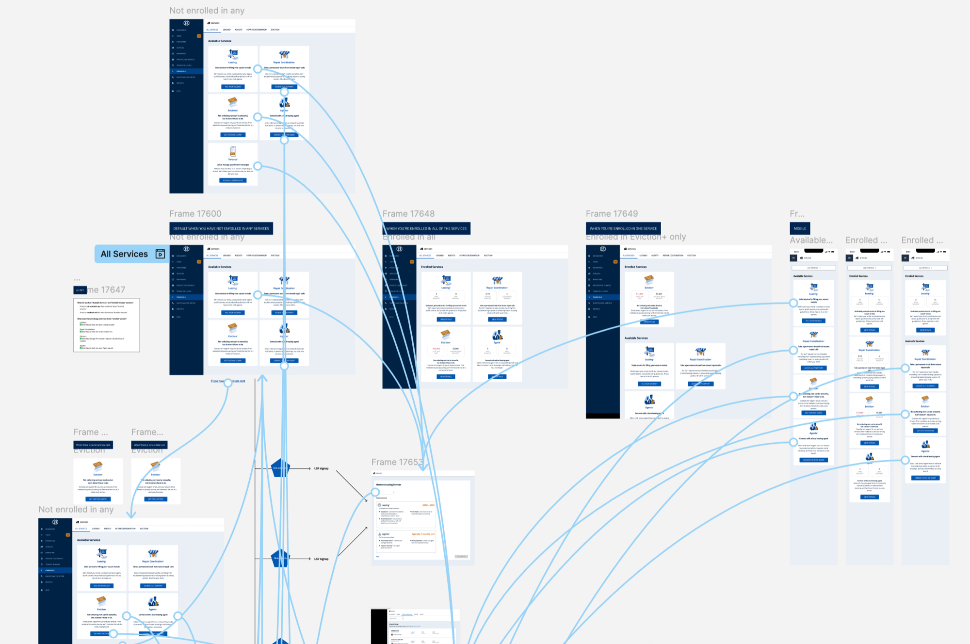
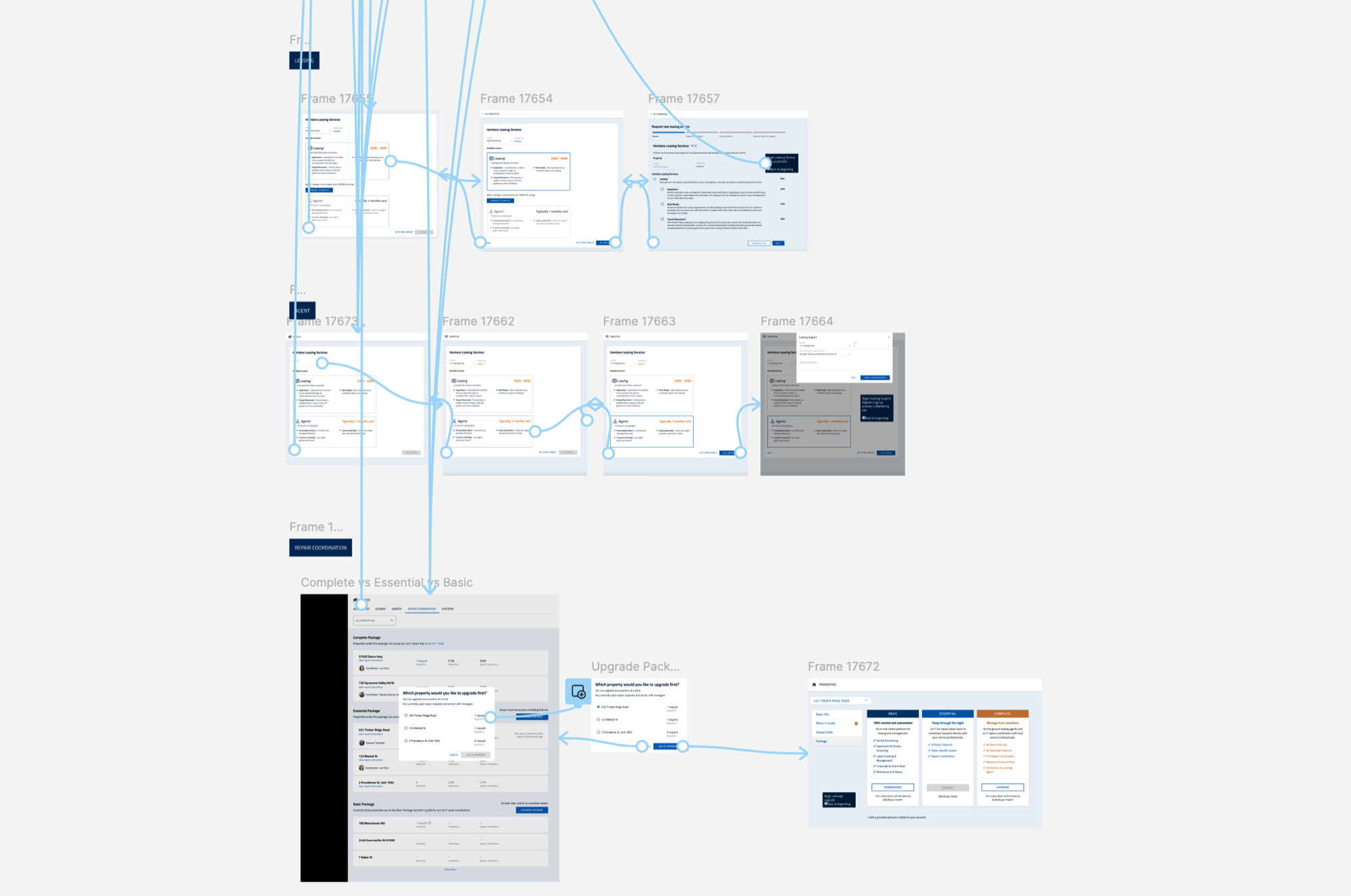
Testing & iterating
I ran multiple design sessions with the PM, cross-functional partners (including eviction specialists for Eviction+), and developers. After launch, no major revisions were needed, and I moved on to the next big project: Bank Sync.
Takeaways
Tackling the big by going small
This was one of my biggest projects, with the most individual pages and modals. It felt intimidating at first: every feature page seemed important, and it was an entirely new tab in the product. Working with the product manager and cross-functional partners like the eviction service managers, I learned to break the project into individual feature pages, then into smaller detailed pages.
It’s easy to get lost in the details, so I kept connecting back to the “why” behind each design. That said, I also enjoyed getting into the nitty-gritty: how the cards were organized, the language of each CTA, and the graphic in each card.